USPTO Deadlines
Application History
7 events| Date | Code | Type | Description | Documents |
|---|---|---|---|---|
| May 22, 2019 | MAB2 | E | ABANDONMENT NOTICE E-MAILED - FAILURE TO RESPOND | Loading... |
| May 22, 2019 | ABN2 | O | ABANDONMENT - FAILURE TO RESPOND OR LATE RESPONSE | Loading... |
| Oct 24, 2018 | GNRN | O | NOTIFICATION OF NON-FINAL ACTION E-MAILED | Loading... |
| Oct 24, 2018 | GNRT | F | NON-FINAL ACTION E-MAILED | Loading... |
| Oct 24, 2018 | CNRT | R | NON-FINAL ACTION WRITTEN | Loading... |
| Oct 19, 2018 | DOCK | D | ASSIGNED TO EXAMINER | Loading... |
| Jul 6, 2018 | NWOS | I | NEW APPLICATION OFFICE SUPPLIED DATA ENTERED | Loading... |
Detailed Classifications
Class 025
First Use Anywhere:
Oct 16, 2015
First Use in Commerce:
Oct 16, 2015
Additional Information
Design Mark
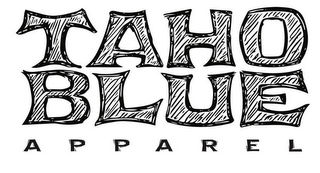
The mark consists of The first and foremost is a clever and uniquely identifiable arrangement by stacking of letters. The letter E, in BLUE, doubles as the letter E, as read in TAHOE. This results in a predetermined way a person reads the word TAHOE. Read left to right, then down a letter, to complete the spelling and reading of TAHOE. The double usage of the letter E, is a clever and uniquely identifiable usage in the market; both visually and in spelling. The fourth letter O, of the word TAHOE, stacks vertically over the fourth letter E, of the word BLUE. The fourth letter E of the word BLUE, has double usage as the fifth letter E of the word TAHOE; a uniquely identifiable manner to complete the spelling of the word TAHOE. The placement of the four letters TAHO directly on top of the four letters BLUE exemplifies this distinction. Both words are constructed of four letters aligned vertically providing a unique identifiable logo. This is a uniquely invented arrangement of the letters in the words TAHO BLUE, providing visual symmetry and aesthetic appeal. The vertical arrangement of the first letter in TAHOE, T, placed over the first letter in BLUE, B, creates a distinct and unique abbreviation, TB, as read vertically, for the name, TAHOE BLUE. The letters, TAHO BLUE, are a unique creation of art, with no precedence, free hand drawn by the Applicant in a unique stylization. Each letter has a symbiotic shape to the letter, next to, above, or below it. The word APPAREL is a visual addendum to the body of the logo. The letters of APPAREL are rendered in a similarly styled font, that is sympathetic to the unique art of the letters TAHO BLUE. The word APPAREL is arranged at the bottom of the logo, such that its spacing is a similar length of the letters above. The stacking and arrangement of letters, is the most defining feature of the logo, both visually and intellectually, making a clever invention, a uniquely identifiable reading of the words TAHOE BLUE. Although the letter art provides unique character and flavor, the most visually outstanding and identifiable attribute of the logo is the stacking of the letters, such that the reading of the name, TAHOE BLUE, is by use of the E twice.
Color Claim
Color is not claimed as a feature of the mark.
Classification
International Classes
025